
PROJECT: WINE LABEL
BRIEF
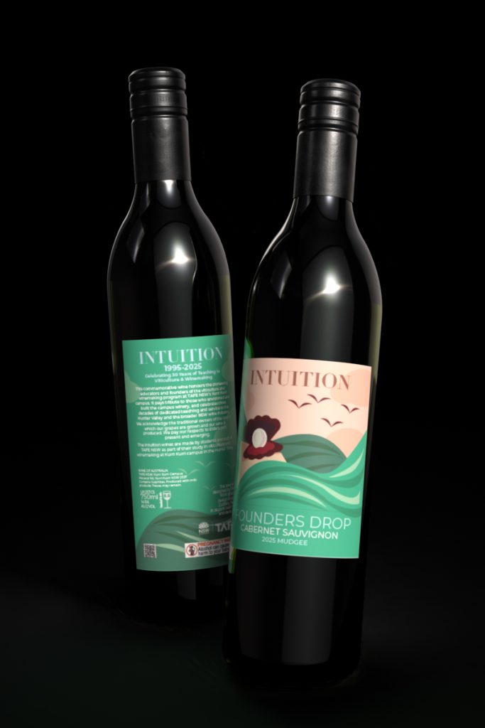
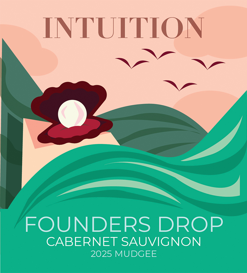
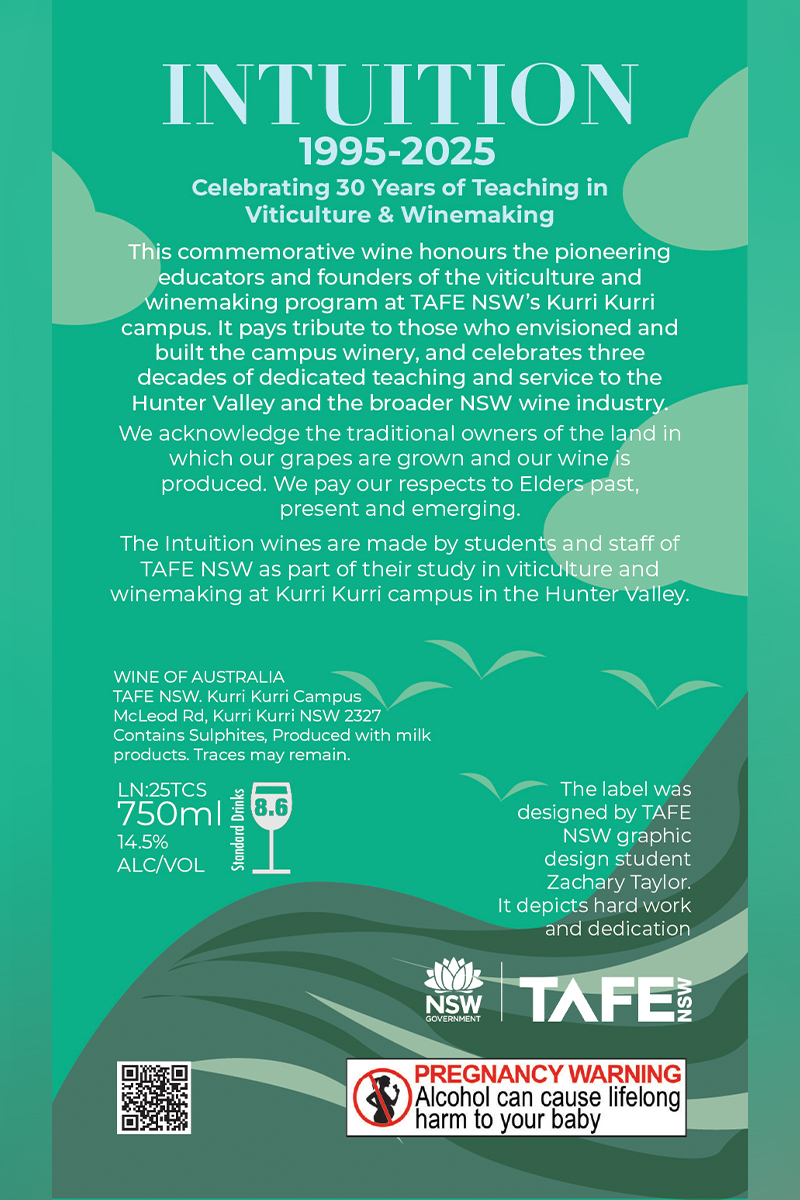
The brief for this was to create a front & back wine label for TAFE NSW Kurri Kurri's viticulture course. As part of the student's course, they create a wine under the 'Intuition' branding. This year was special as it marks the 30th anniversary of the course. They asked for a label that celebrated that using the title of 'Founder's Drop'.
CONCEPT
To many, work is more than just a daily routine, it’s a lifelong commitment, much like a marriage. It demands perseverance, trust, and a deep sense of dedication. Drawing from this analogy, I’ve embraced the tradition of marking anniversaries with symbolic gifts, each representing the strength and beauty of enduring partnerships. The 30 year milestone is traditionally associated with the pearl, a gem formed through time, patience, and resilience. The pearl imagery serves as a tribute to the grace and value of three decades of commitment. The rich reds woven into the design evoke the warmth and depth of red wine, a nod to the celebratory spirit and the region’s renowned vintages. In contrast, the lush greens mirror the rolling valleys of the Hunter, grounding the piece in the natural beauty and heritage of the land that has supported and inspired us. Finally, the four birds soaring in the distance represent the founding members, visionaries who took flight together, charting a course that others would follow. Their presence in the composition is subtle yet profound, a reminder of the shared beginnings and the enduring legacy they’ve helped create.